5 office design mistakes to avoid
When designing your office it’s always a good idea to take inspiration from exciting and innovative workplaces. Similarly, it’s just as important to know what to avoid. From poor lighting to colour schemes that are “too bold”, take inspiration from the five worst office design decisions you want to avoid making
Design decisions to avoid
When designing your office, it’s always a good idea to take inspiration from exciting and innovative workspaces – to look at the best of the best and find out what elements might work for you too.
However, it’s just as important to know to avoid. Poor office design doesn’t just look bad, it has an adverse impact on employee wellbeing, reduces creativity and inhibits collaboration. Refrain from making these common design mistakes and you’ll be closer to creating a space that prioritises the health and happiness of your workforce.
To help you dodge any potential pitfalls, we’ve compiled a list of the five worst office design decisions you want to avoid making.
1. A completely open-plan office
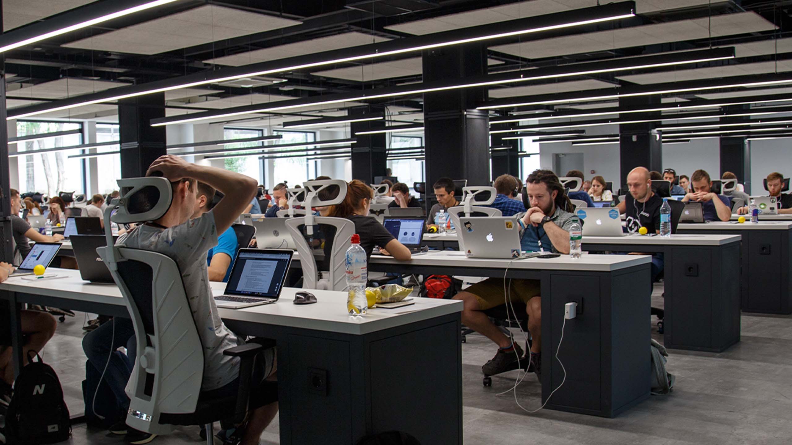
Open plan offices are a response to the cubicles of the 90s and are meant to encourage bonding between employees. However, we now know that an open plan office is often inappropriate. The design can hinder concentration, creativity and productivity due to noise, interruptions, distractions and lack of privacy for all parties. For those who require the capacity to do deep, concentrated work, an open plan office can be highly disruptive.

Incorporating a variety of work settings, paired with an agile working approach, affords employees control over their working environment. The workplace needs to reflect differences in cognitive functioning, to help every person to concentrate, manage distractions, process information and communicate effectively. The ability to choose the level of both sensory and social exposure allows people to move to the most suitable environment for the task in hand, where they can function at their best. Sensory factors in the environment such as colour, sound, texture, lighting, temperature and smell can over or under stimulate people.
For some, being surrounded by noise and other people is essential for optimal functioning to do their best work, whereas others prefer quiet, sheltered areas. Booths, nooks, alcoves as well as neighbourhoods and clusters enable people to choose their level of noise and privacy. A balance between shared, open spaces that facilitate collaboration and smaller, enclosed settings that support focus work is important. Having a range of spaces allows people to manage their own needs and choose the surroundings in which they work best.
A ‘broken plan’ office is a good alternative for those who want the benefits of collaboration and ease of communication, while including greater privacy and fewer distractions. Well-designed broken plan offices will retain the feeling of space but integrate private areas for those who need peace and quiet to work.
2. Poor lighting
Good lighting is like your IT department. When everything is running smoothly you rarely notice it, but when it’s not right it gives everybody a headache.
There is plenty of documented evidence to support how necessary good lighting is to a working environment. Poor light can cause headaches, eye strain and migraines. It can also affect mood, especially during the Winter months where we have shorter days and less daylight.
Decades of research have proven the powerful impact of lighting on health, wellbeing and productivity. 90% of our time is spent indoors on average, meaning good lighting is fundamental to office design. Light is not only needed to meet visual needs, but to sync our circadian rhythm. Sunlight regulates our internal body clock through photoreceptors in the retina, regulating the hormones responsible for our sleep/wake cycle. The balance of serotonin and melatonin can be linked to sleep quality, mood, alertness, appetite, mental health and other health conditions. Disruption due to poor lighting can impact health and wellbeing, increase fatigue and impede stress management. Lighting needs to be bright enough to support and maintain energy levels, mood regulation and sleep quality. At work, this translates to better performance, concentration and alertness, as well as fewer errors and absenteeism. Recent research has helped to develop indoor lighting that mimics the cycle of natural daylight, called bio-dynamic lighting. The artificial lighting changes colour and intensity over the course of the day, allowing the biological effects of natural daylight to be simulated inside.
Good lighting is one of the best ways to ensure a healthier and happier workforce. Incorporate a mixture of natural light and carefully designed lighting within your office, taking both the space and the task at hand into consideration. Don’t forget that your lighting needs to be compliant with emergency lighting guidelines.

3. Ignoring wellbeing
When agile working and employee wellbeing first became important to office design, designers liked to incorporate elements of play, often at the expense of anything else. There was a time on the early 90s when the offices of trendy companies were borderline indistinguishable from a sixth form common room, or even a toddler’s playgroup, with slides, beanbags and ball pools competing for space with boring stuff like desks.
Now many companies have developed a more mature and nuanced approach to wellbeing and health.
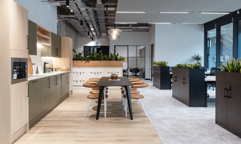
Effective break rooms allow team members to relax and recharge, to find their creativity and increase their efficiency. A breakout space increases employee engagement by encouraging interpersonal interaction and team bonding[1]. This, in turn, increases employees’ trust in their environment and managers and improves happiness and efficiency.[2]
Promote physical wellbeing in the workplace by installing multiple areas for team members to move between. The World Green Building Council’s 2014 report Health, Wellbeing and Productivity in the Offices underlines the importance of taking ‘time out’, revealing workers who break for 10 minutes out of every 90 worked have 30% more focus, 46% more overall wellbeing and 50% more creativity.

Of course, health is a key factor in wellbeing. The World Health Organisation recommends 150-300 minutes of moderate-intensity physical activity per week. With many jobs being primarily desk-based, and the average person sitting for 9.5 hours per day, the detrimental effects of inactivity and sedentary behaviour need to be counterbalanced through more movement in the working day. Active travel, such as cycling, running or walking to work, can have a profound effect on our experience at work, helping us to feel more energised, improve performance, inspire creativity and manage stress better. It can have a significant impact on the happiness and health of the workforce.
The easiest way to form active habits is to make them part of our day. However the most significant barrier to active commutes is often a lack of facilities at work. Having a sufficient number of well maintained, pleasant showers, lockers, drying facilities and secure bicycle storage is crucial to motivate people to move away from driving to and from work.
4. Form not following function
The adage “Form follows function” was coined by architect Louis Sullivan in 1896, after he determined the shape of the first steel skyscraper by looking at its function rather than adhering to current styles. In the design world the phrase has come to symbolise a disregard of superfluous decoration. Even in the 21st century, it still holds weight, especially in an environment where aesthetics and functional design converge, such as the office. However, sometimes the aesthetic design of the workspace can hinder its functionality.

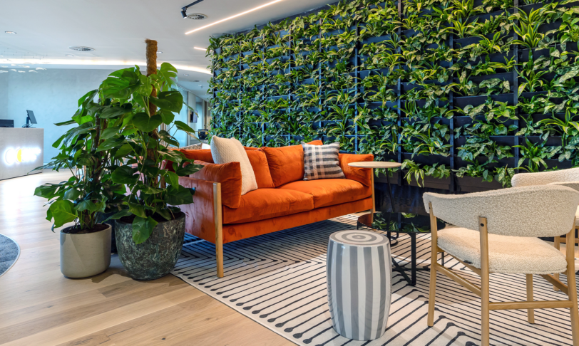
Intimidating design can lead team members to avoid certain spaces, which is particularly worrying if a space is designed to be used and enjoyed by employees or visitors. A cutting-edge, modern reception area might look sleek but it may not be inviting if the sofas aren’t comfortable. A break room that is not fit for purpose can lead staff to have lunch “al desko”.
Spatial order and ease of wayfinding reduces the cognitive load needed to understand a space. By creating physical cues in the design such as edges, focal points, borders and paths, the intended use of the space is inferred, navigation is made easier and all spaces are utilised.
5. Off-colour schemes
Like lighting, a good colour scheme will improve mood, mental clarity and creativity. The opposite is said for colour schemes that are too bold or contain clashing colours. They may be designed to make a strong statement and have an impact on your audience and visitors, but they could negatively affect your team. Bold colour schemes can contribute to mood changes and anxiety, especially when multiple colours are involved in the design.
Use bold colours in moderation and separately if you’re looking for a strong impactful design. When looking for colours to cultivate creativity in your space, a study from the University of Texas found that blue and green encouraged innovation and promoted a calm working environment.

Conclusion
Understand what contributes to bad office design and you can avoid letting it sneak into your workplace plans. At Interaction, we help organisations every step of the way from workplace strategy to office design services, office fit-out and refurbishment to furniture consultancy. We ensure your office is a space in which your team thrives. Get in touch to find out more.
Sources
[1] de Been, I., Beijer, M., & den Hollander, D. (2015). How to cope with dilemmas in activity-based work environments: Results from user-centred research. In 14th EuroFM Research Symposium (pp.1–10). Glasgow
[2] Engelen, L., Chau, J., Young, S., Mackey, M., Jeyapalan, D., & Bauman, A. (2019). Is activity-based working impacting health, work performance and perceptions? A systematic review. Building Research & Information, 47(4), 468-479. DOI: 10.1080/09613218.2018.1440958


