Reimagining RedRock’s workspace
From major government departments to firms in the tech and finance sectors, RedRock Consulting partners with diverse clients to navigate the ever-evolving landscape of technology, competition, and business imperatives. RedRock needed an office that mirrored their agile work, prioritising connectivity and adaptability.
Interaction had designed RedRock’s previous office in 2018, meaning we were well placed to transform their workspace. With just 10 days between the design pitch and contract being signed, it was clear RedRock trusted Interaction completely to deliver their vision for a more modern office that reflected their culture.
From capturing our requirements through to completion of the project, Interaction have excelled. We’re genuinely delighted with the transformation of our space and how it has brought our people together.
Dean Harte
Chairman, RedRock
Prioritising community and collaboration
A brilliant new breakout space
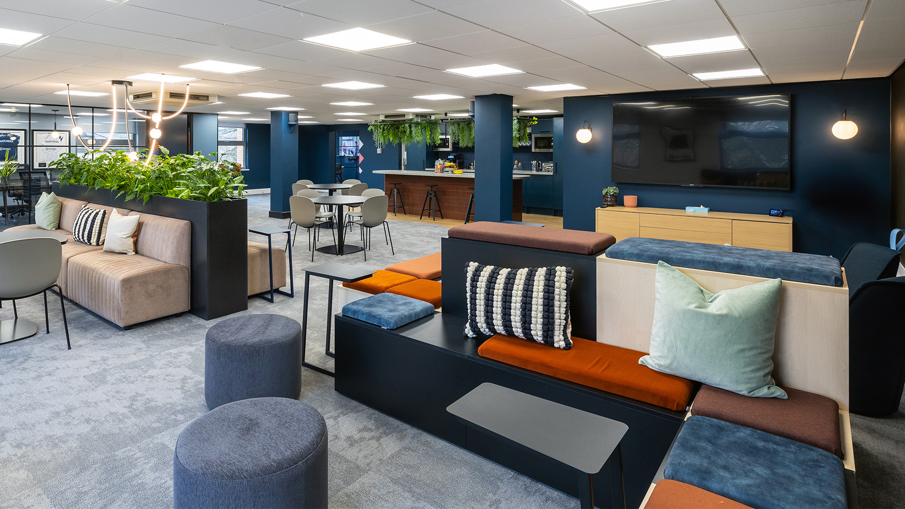
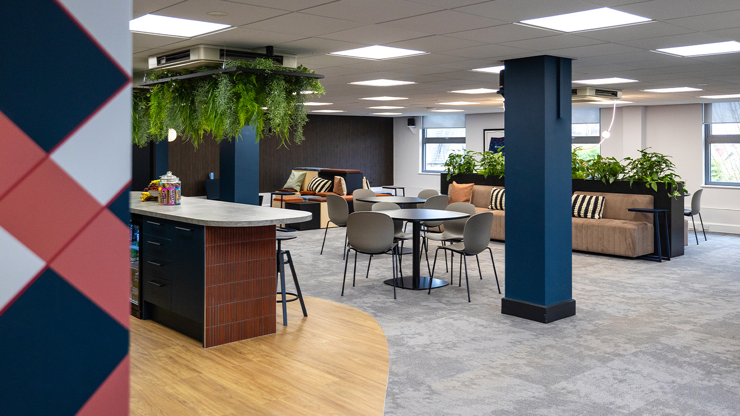
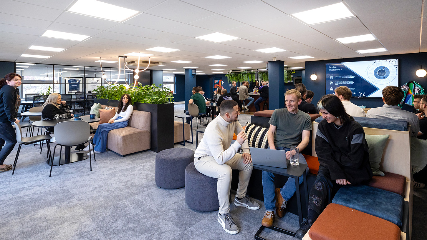
RedRock’s workspace was no longer working for them with people separated and forming silos at either end of their office. We transformed the layout of the space by moving the breakout area from the centre to one end of the office, allowing the work areas to become unified.
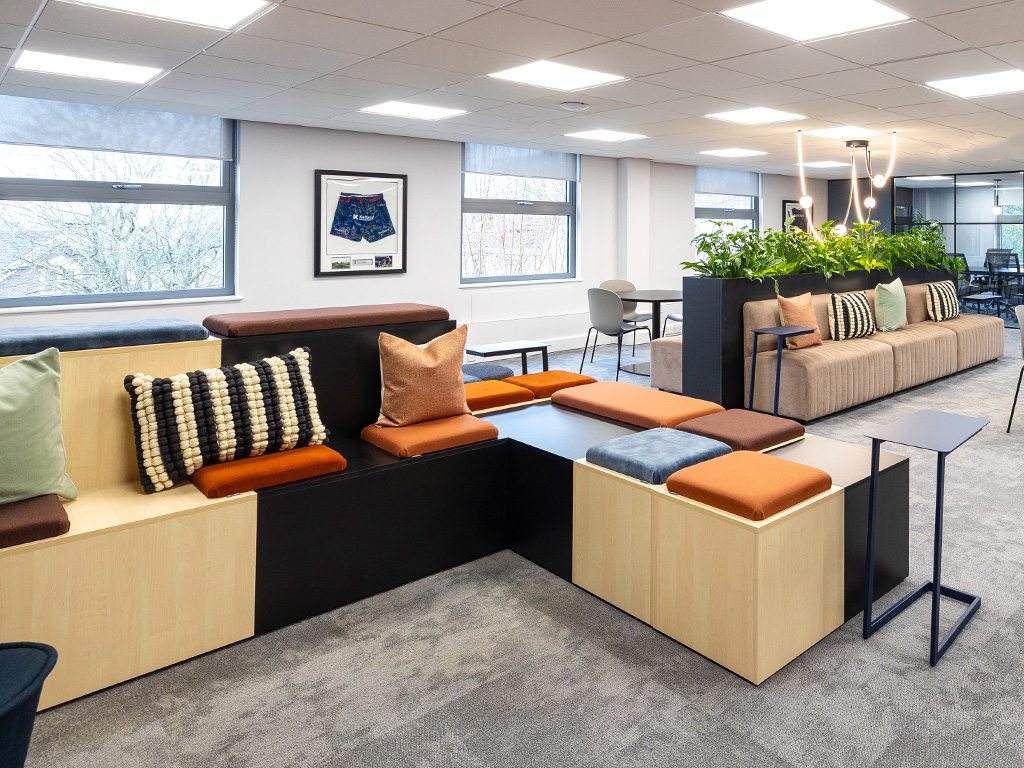
The new breakout space was designing to be multifunctional and suit RedRock’s ever-evolving business. Modular tiered seating can be reconfigured to provide space for events, company meetings or become the perfect spot for some lunchtime PlayStation.
Large lunch tables that had rarely been used have been were swapped for smaller, more flexible tables. Now, with multiple soft-seating options, flexible furniture and bar stools, the breakout area has become a hive of community and collaboration with space for everyone to enjoy it at once.
A new trophy cabinet helps zone the breakout area from the desk space, ensuring employees can take a proper break from work in a space the feels separate from their desks. The result is an office that prioritises community, productivity and wellbeing.
Sleek, modern and on-brand
Reflecting RedRock’s personality
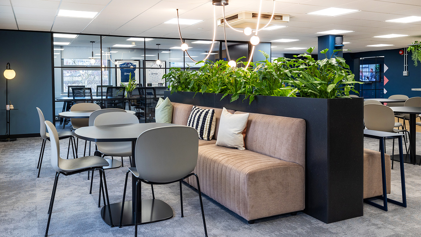
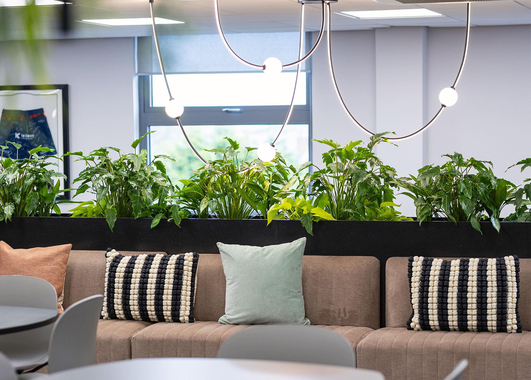
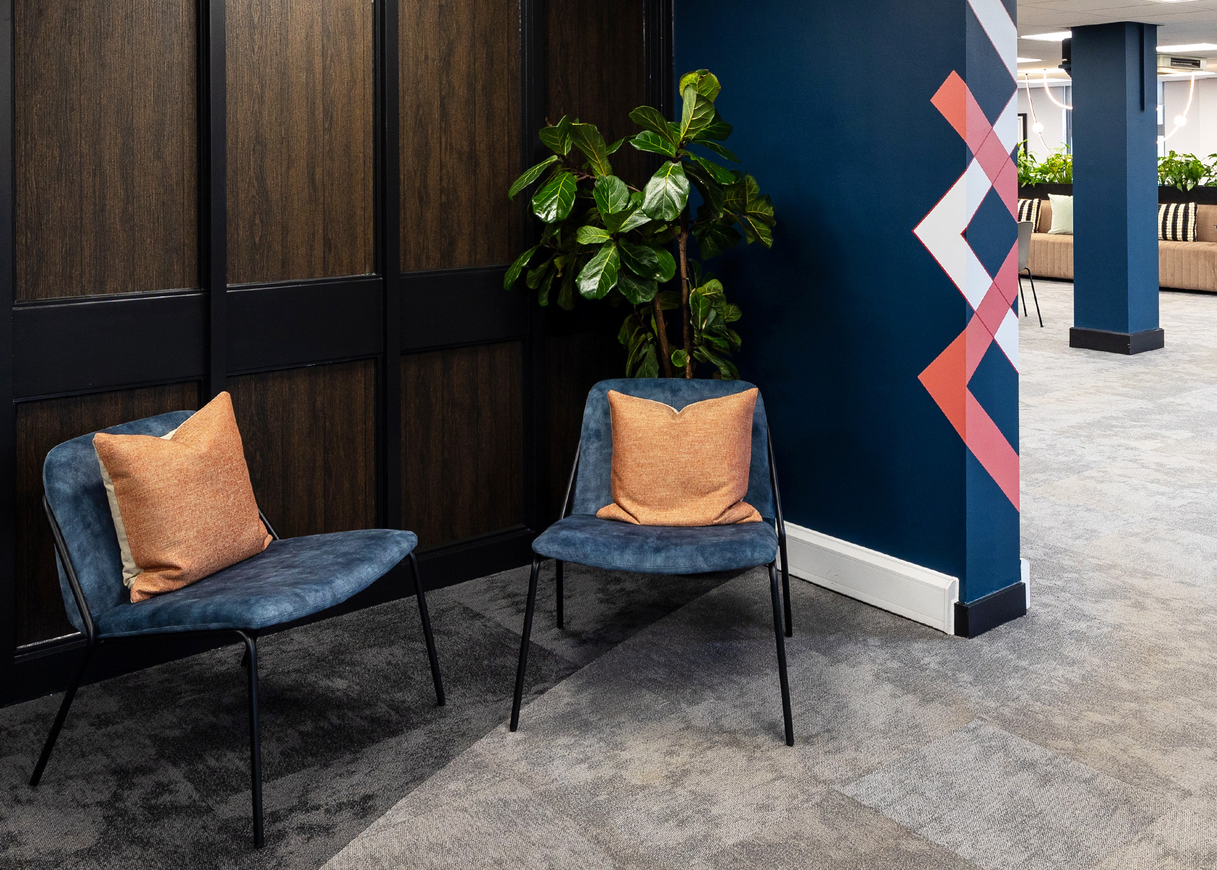
RedRock wanted their office to feel sleek, modern and on-brand – without feeling overly corporate. We chose a neutral colour palette with navy, red and salmon accents to match RedRock’s branding. Harsh lighting was replaced with softer lights for a warmer, more inviting atmosphere. Originally meant for the boardroom before realising the ceiling was too low, the Calico feature light has become the focus of the breakout area.
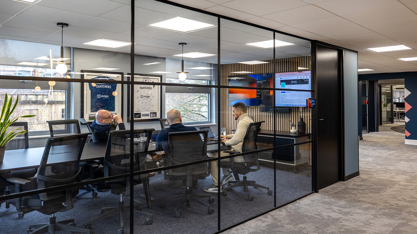
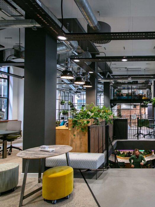
With sustainability at the heart of RedRock’s business, existing furniture was reused where possible rather than being discarded. Focus booths were moved to make room for a new reception area, providing new focus space by the desks. The glass window frames were rewrapped in black vinyl to modernise the space without the need for new panelling.
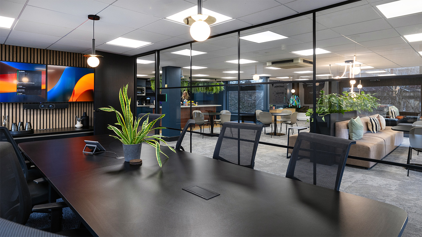
Now operating as a hybrid business, improving the connectivity of the workspace was high priority in the redesign. Screens have been added to meeting rooms, whilst the boardroom is now larger to become the perfect space for both client and hybrid meetings. Acoustic panelling in meeting spaces and focus booths helps reduce noise from private calls.
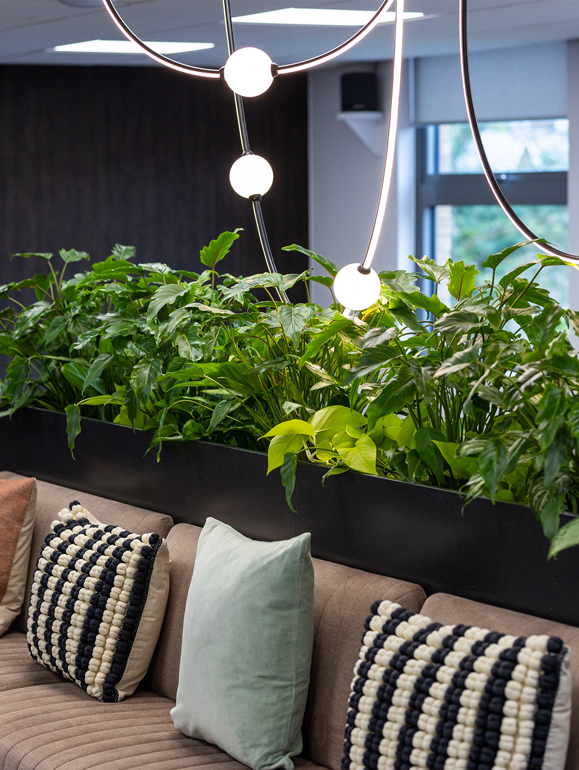
As proud sponsors of Bristol Bears Rugby, framed rugby shirts add personality to the office, whilst an abundance of planting helps bring the outside in and soften the navy and black accents.
Design Features
Details that matter.
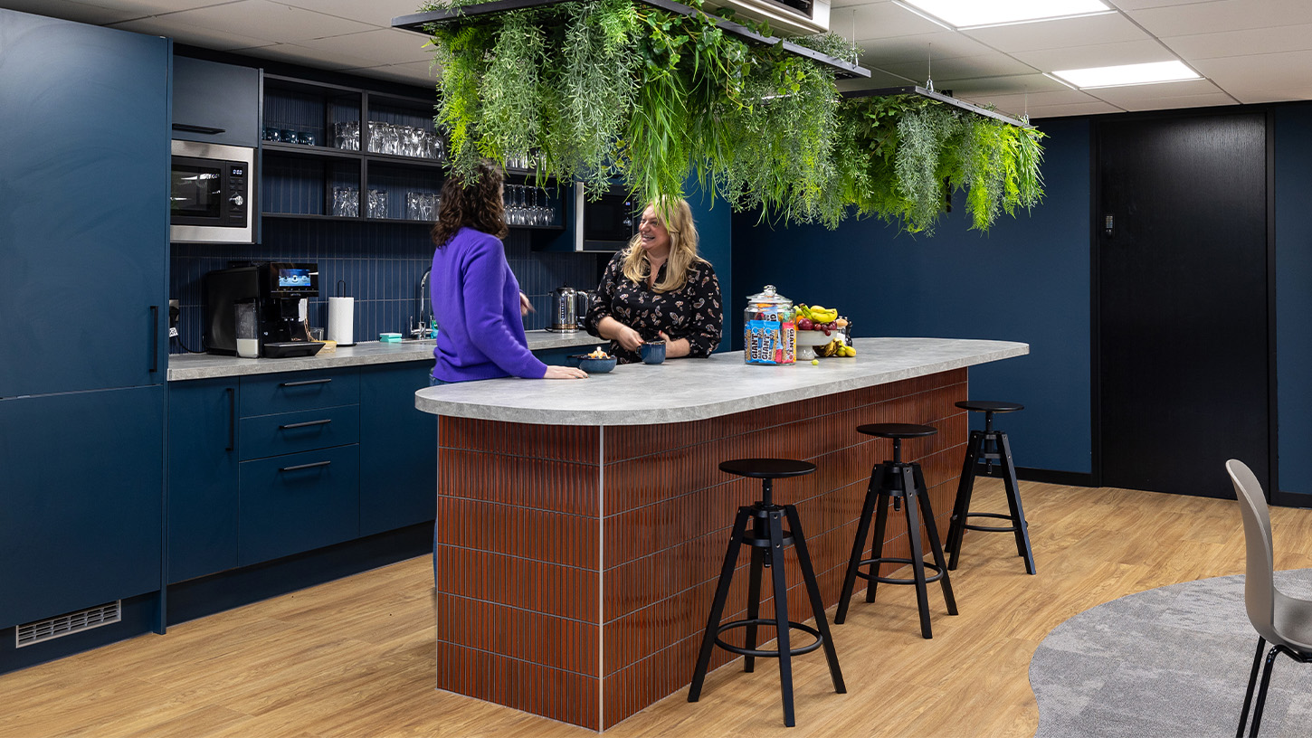
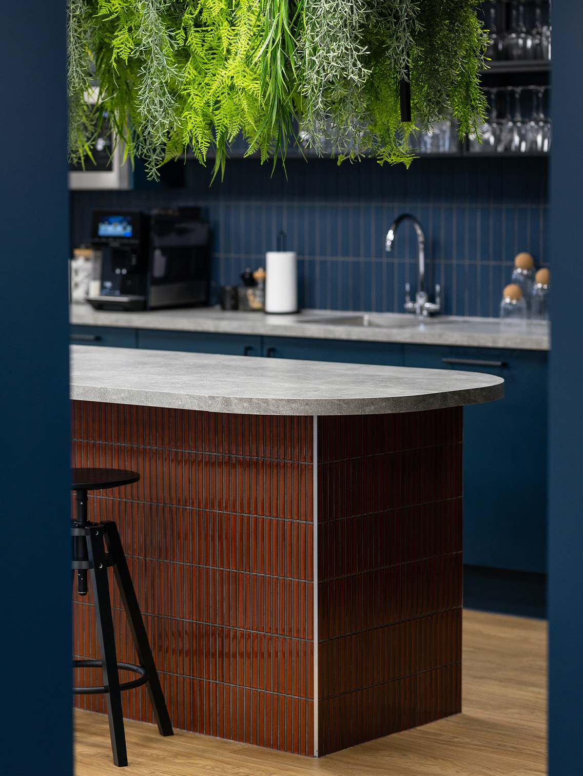
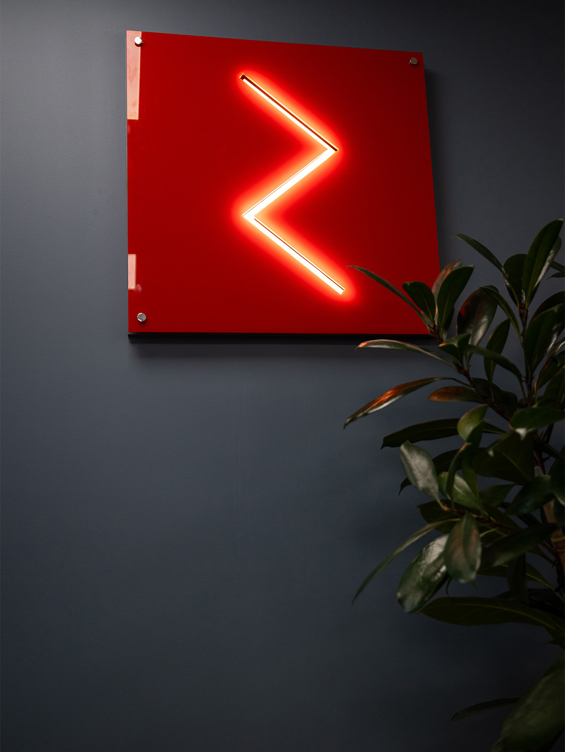
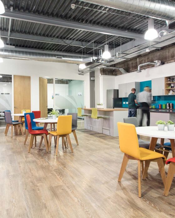
A curved kitchen island and hanging plants bring a softness to the industrial style kitchen. A one-of-a-kind RedRock light was commissioned for the space, and pairs perfectly with the Calibo feature light that adorns the breakout area. Comfy seating and soft furnishings help the space feel like home, whilst offering alternative areas for casual meetings or collaboration sessions.
Case Studies
If you liked that, you’ll love these
Discover how Interaction helped these businesses reach new heights
Time to revolutionise your workplace?
We’d love to hear your plans. Get in touch with Charlie to see how we can bring them to life
