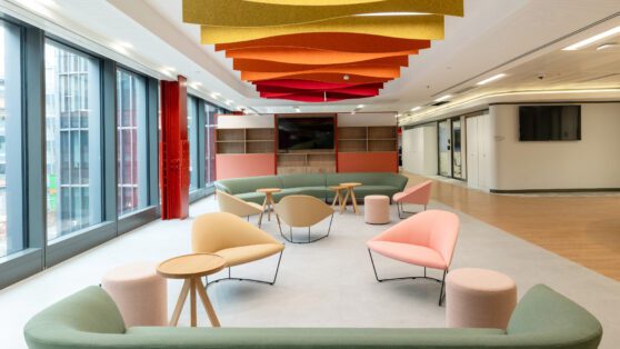
We helped Fleetcor redefine their ways of working – and demolish silos along the way.
Fleetcor is a worldwide leader in business payments, helping companies automate, secure and digitise their transaction systems, processing billions of transactions across more than 100 countries.
After a period of enforced working from home, Fleetcor wanted to create a space their staff would be excited to return to – a fresh new start signifying their ambitions and growth trajectory. However, their intention to move pre-dated the restrictions, and they had already been exploring ways to redefine their workplace while staying local to Swindon. It was important that the new office be markedly different from the space they inhabited before the work from home limitations were imposed. Where there was once a sea of desks delineated into various silos, they now needed a space geared to collaboration – one that could grow and shrink as required.
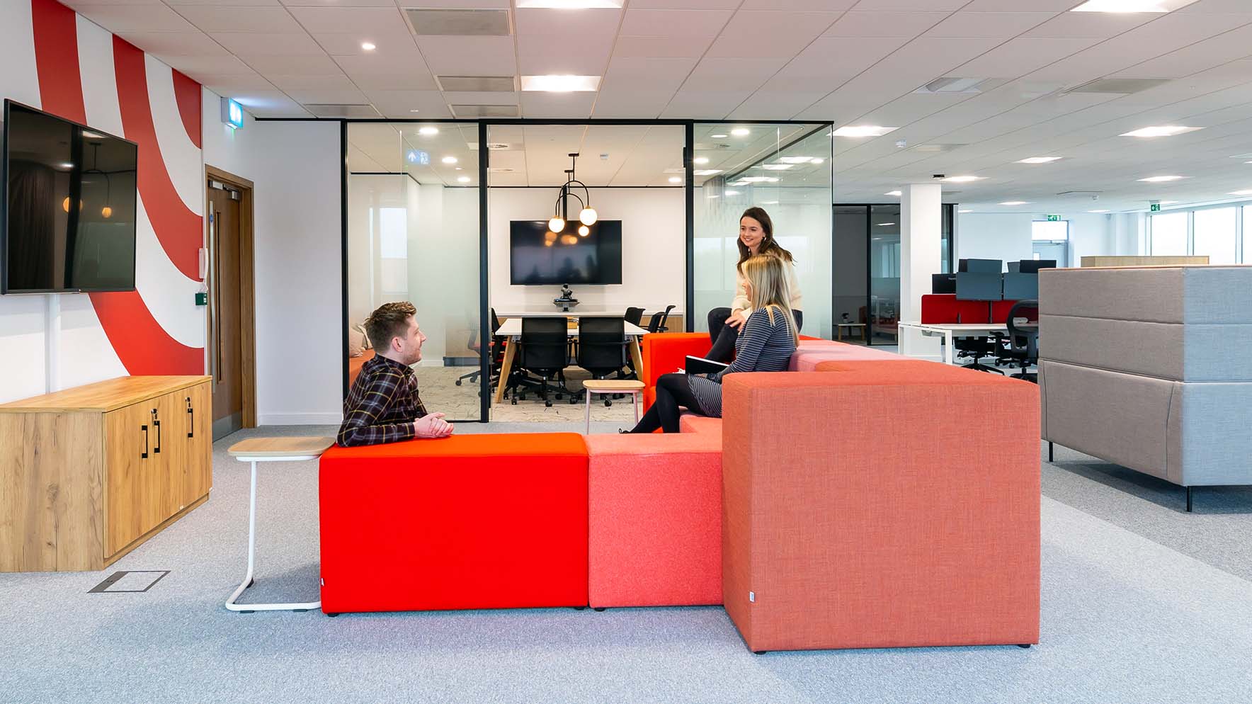
We visited the site to get a feel for what exactly success looked like to Fleetcor, before working up moodboards outlining 4 different approaches, eventually settling on light and warm themes, accentuated by splashes of colour. We created a series of test fits to further tease our Fleetcor’s true requirement of the space from the number of rooms, designated areas, and teams that need to be accommodated. To help reduce silos between teams, each floor is split vertical and horizontally into 4 “neighbourhoods” – key areas which could scale or shrink as necessary, having no fixed perimeter.
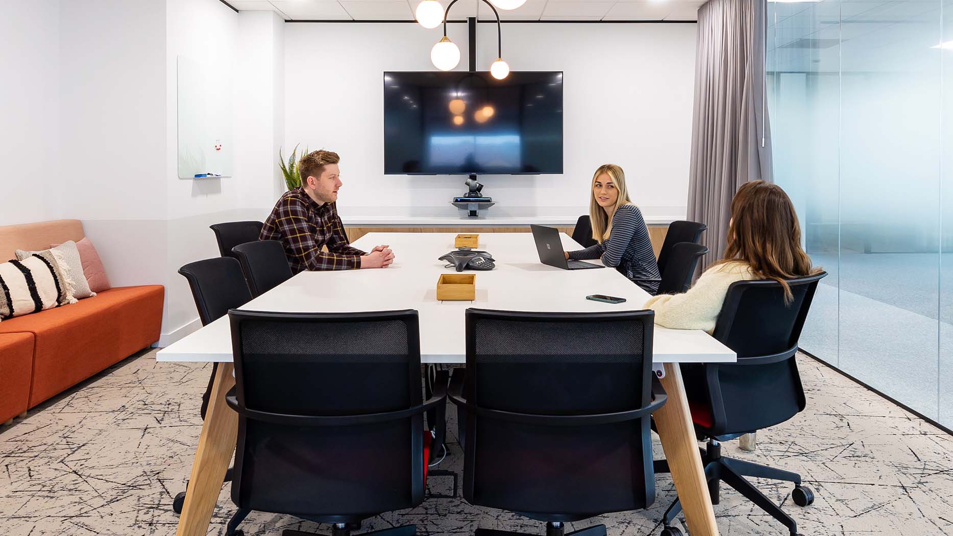
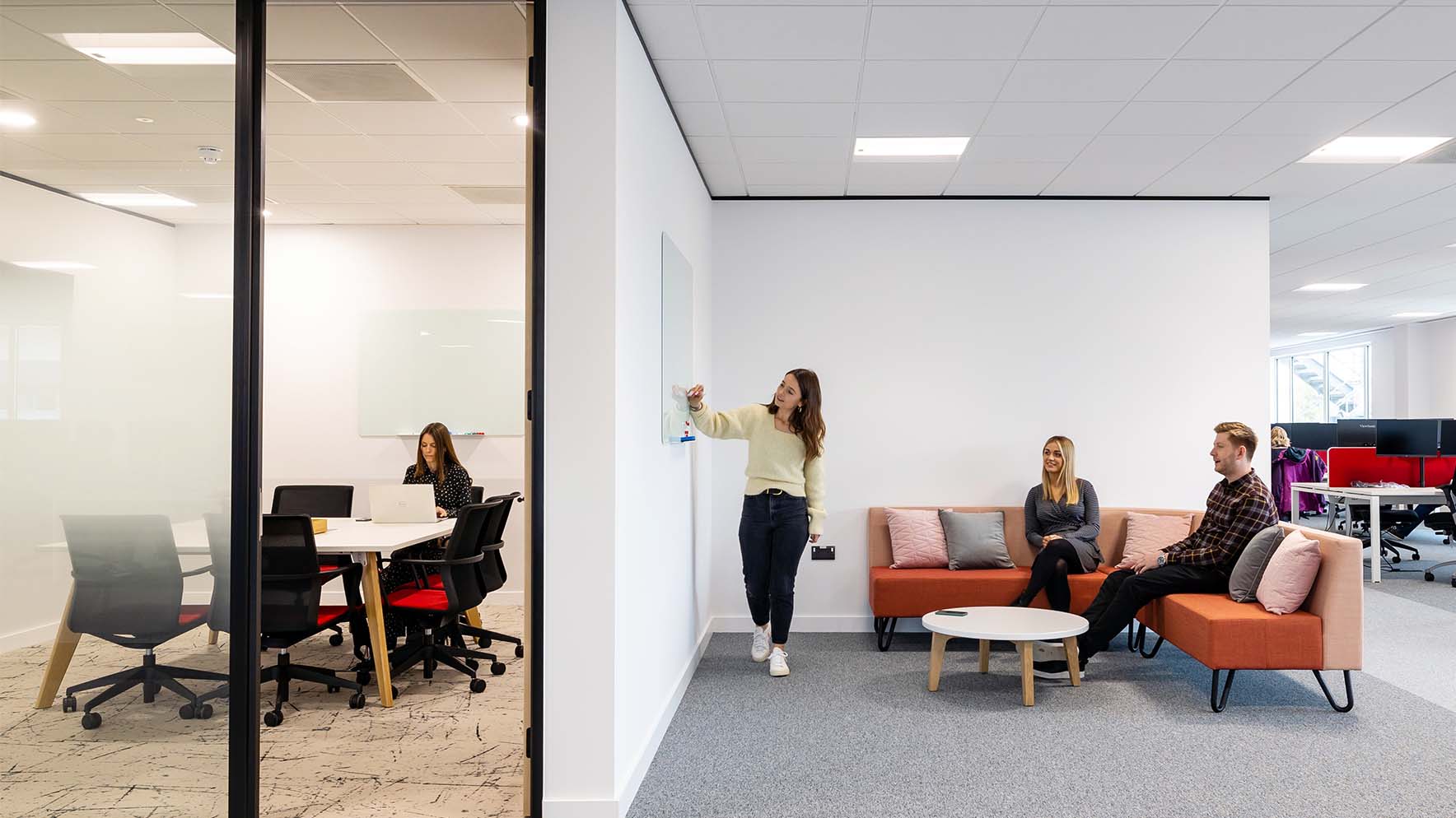
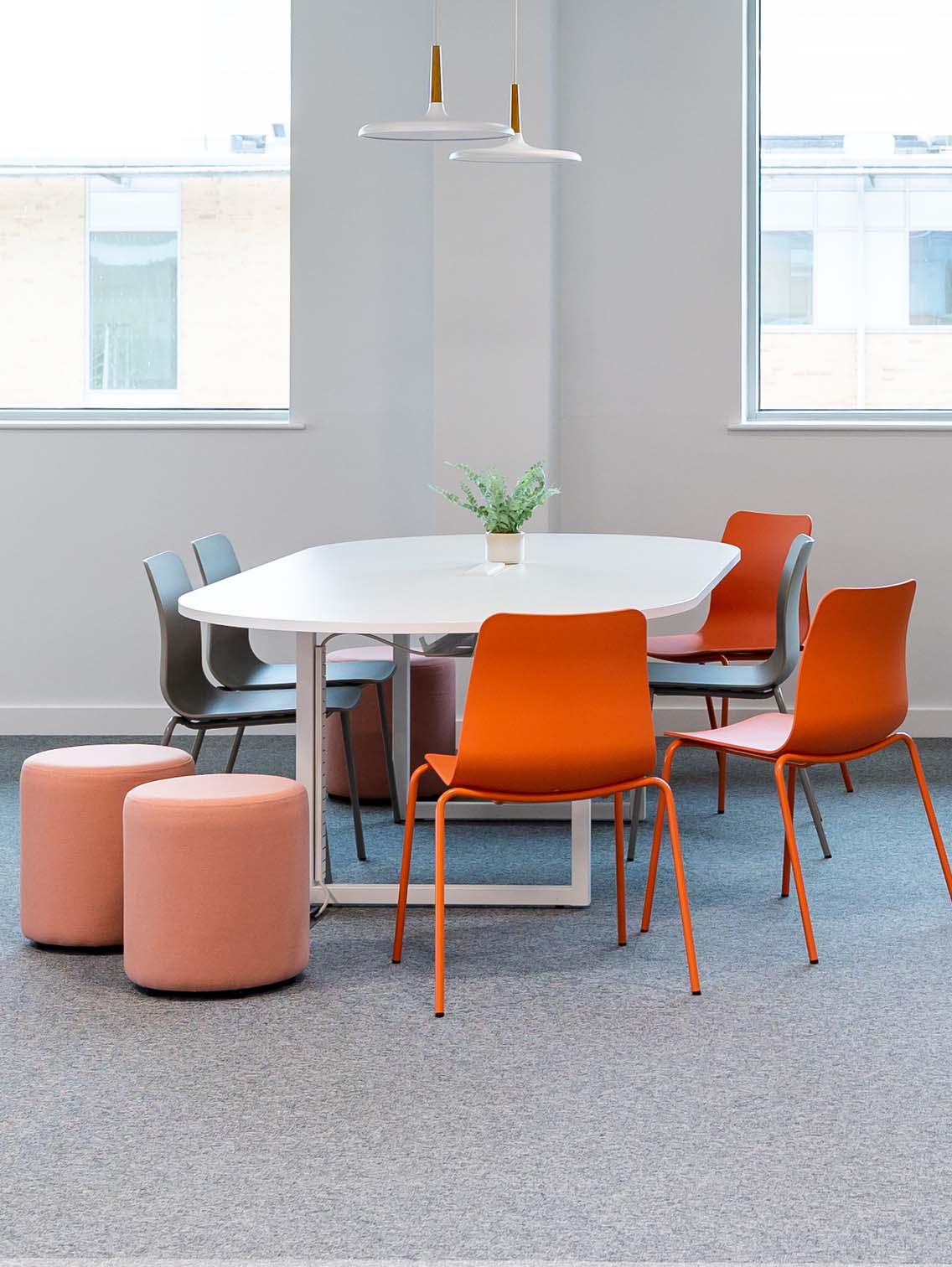
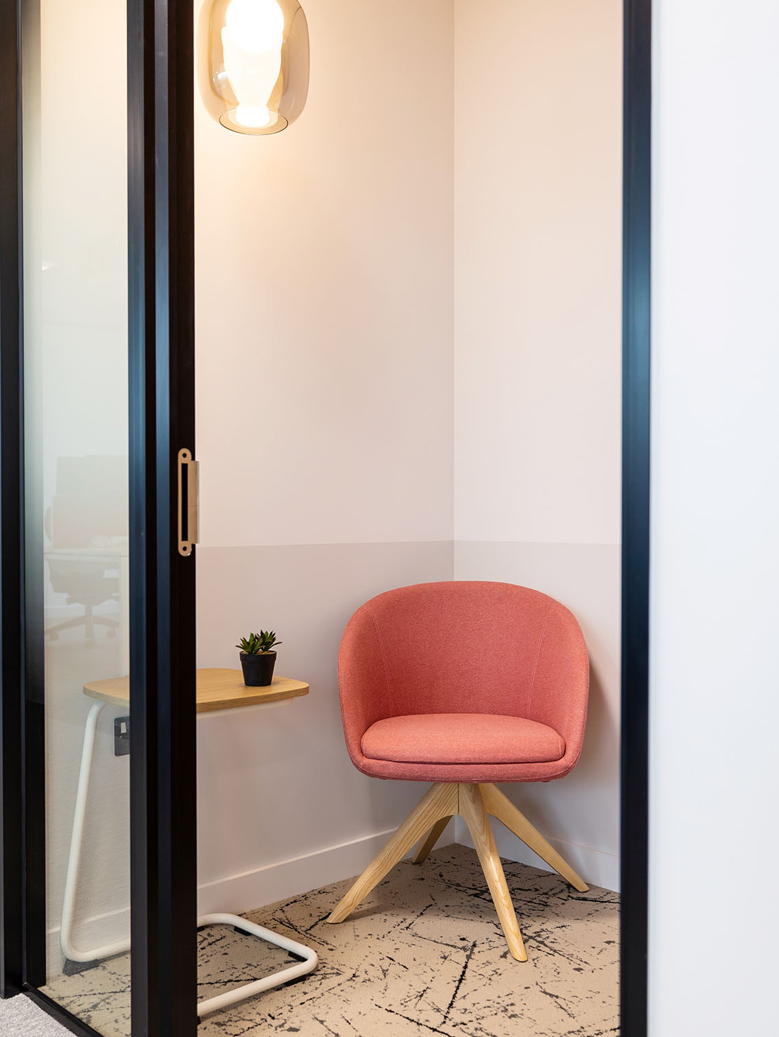
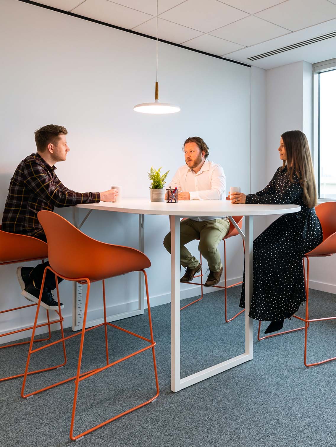
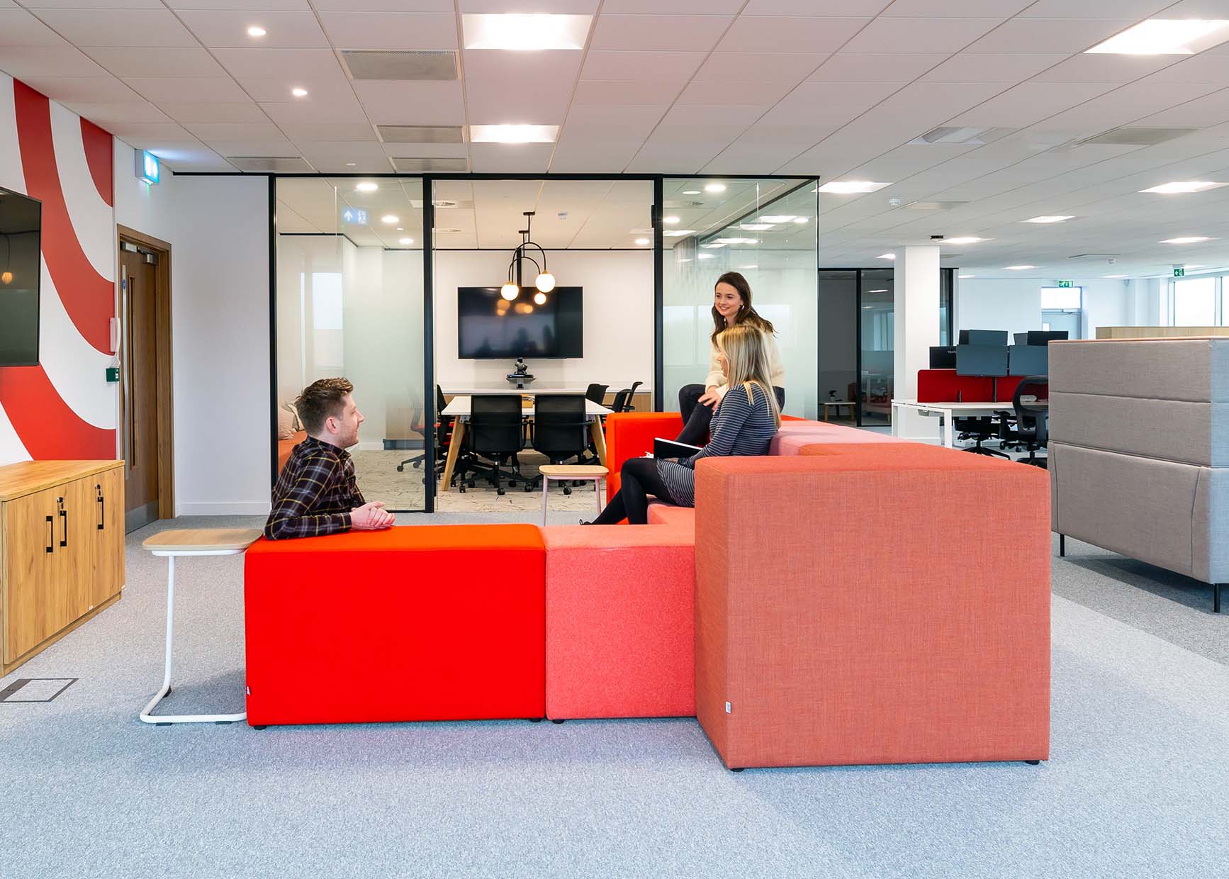
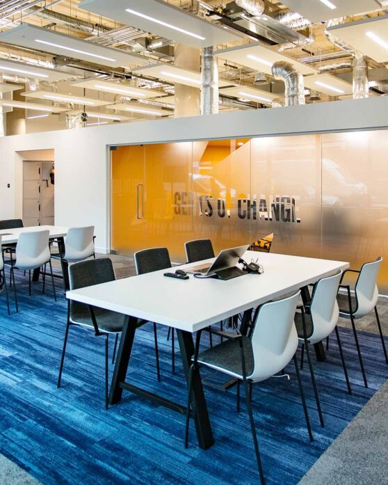
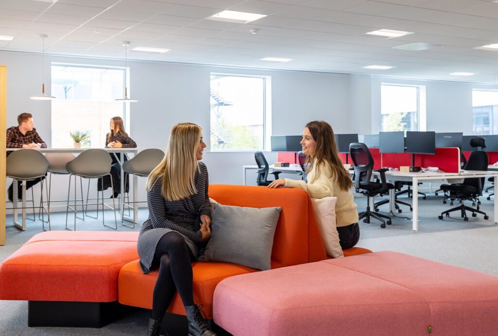
Similar settings can be found in each neighbourhood; a quiet space, a meeting room and collaborative spaces; whether that’s a high table and whiteboard, a booth or team tables to gather around. To help promote a cohesive yet flexible environment areas are sectioned using furniture rather than partitions, and flooring helps guide people around the space.
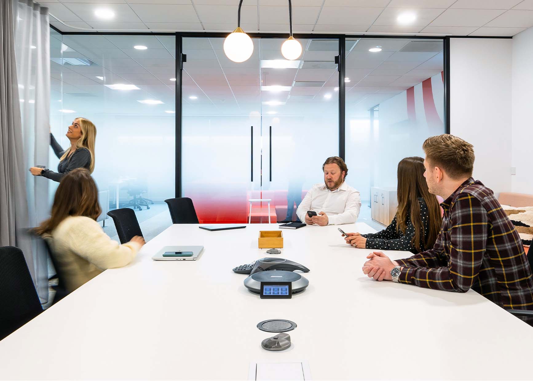
Previously, meeting rooms were situated around the perimeter of their office blocking any natural light. When we designed their new office it was important meeting rooms were situated in the core of the floorplate so individuals sat in neighbourhoods could benefit from natural light. This was a functional decision which made a big difference to the team’s wellbeing.
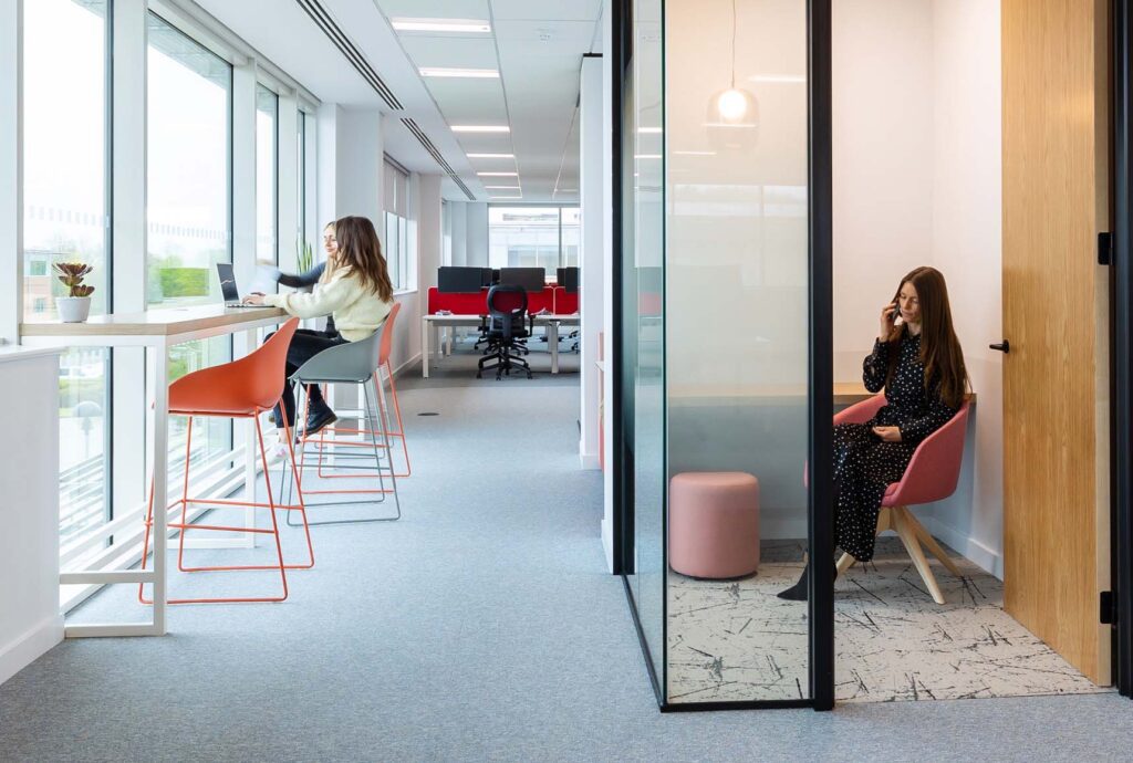
We wanted to create Fleetcor a landscaped, changeable environment, so we designed a series of expandable/retractable zones to provide futureproof flexibility.
Pamela D’AlessandroInteraction
Acoustic architecture
Aligning neighbours, building community.
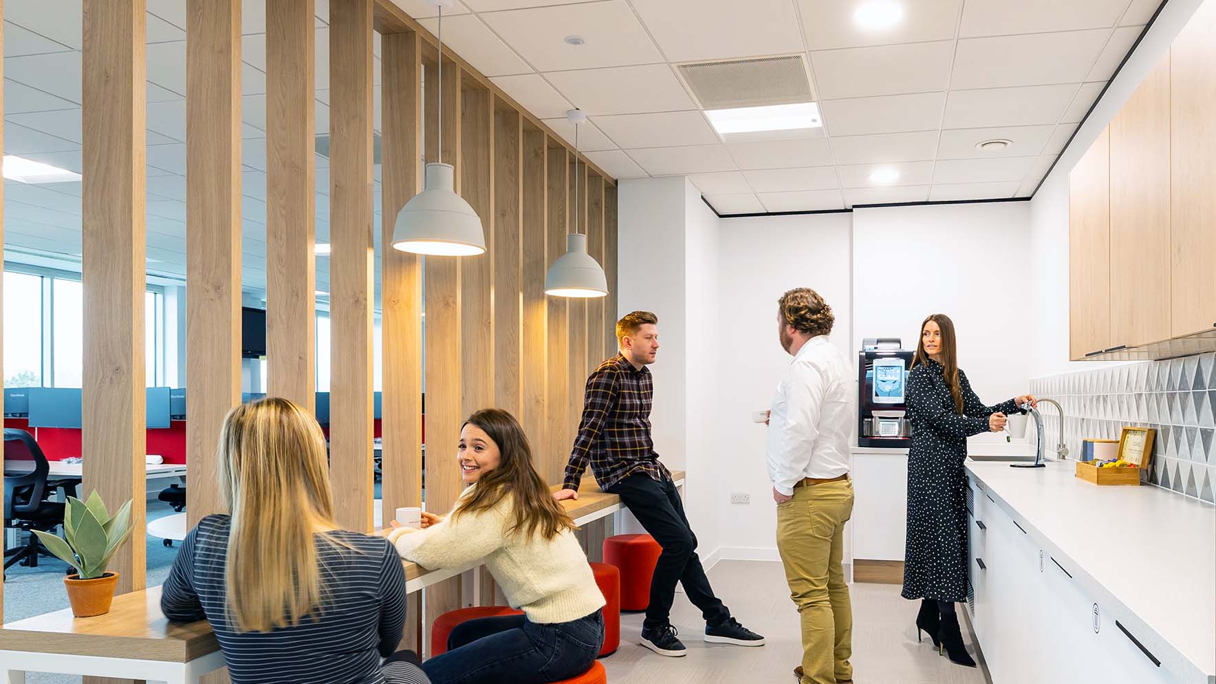
A key part of Fleetcor’s operation revolves around a busy call centre team who we housed in a space with carefully designed breaks, baffles and strategically-placed meetings rooms to minimise any disruptive noise. Two Print Rooms were created to house all postage and stationary while two spacious Comms rooms provided a home for the required masses of technology. A central area was developed as a Town Hall space, with a tea point designed to provide a communal eating space and tie the floor together.
Now a journey through Fleetcor begins with arrival in an informal reception area – a natural place to pause or greet colleagues for a chat – before entering the main reception, with a tea point serving as the ideal place to make a drink before moving to a collaborative space. This breakout space and kitchen also serves as an anchor point to bring together teams from the different floors and help further reduce silos.
The neighbourhoods are subtly delineated, each containing a mix of working environments and modular furniture, which means the space can be used in a variety of ways. Meeting rooms and desk layouts have been optimised to allow people natural light and free movement between neighbourhoods. The space works both as a cohesive whole and as smaller sections, giving Fleetcor the flexible, accessible, engaging workspace they require.
Design Features
Details that matter.
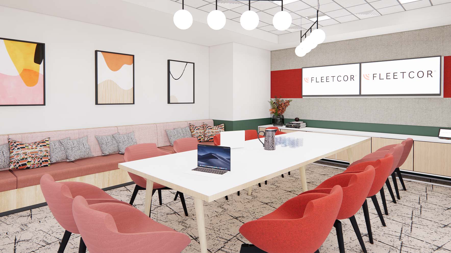
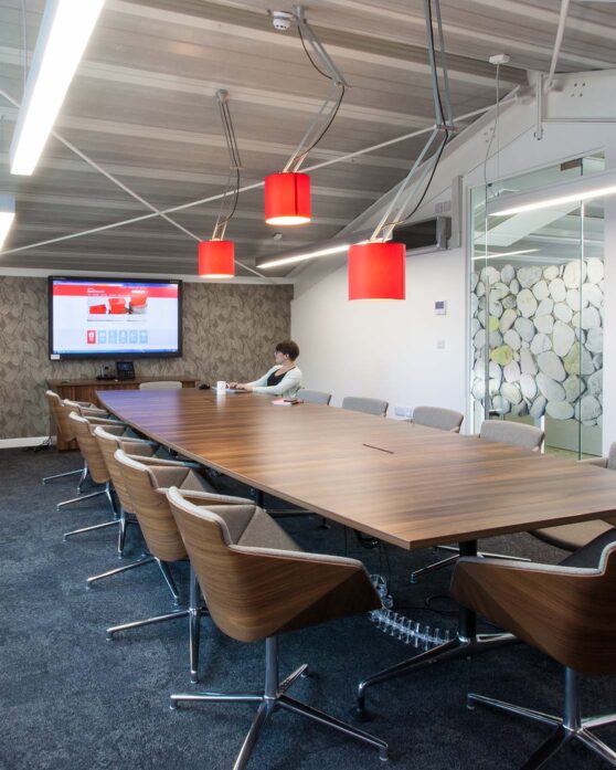
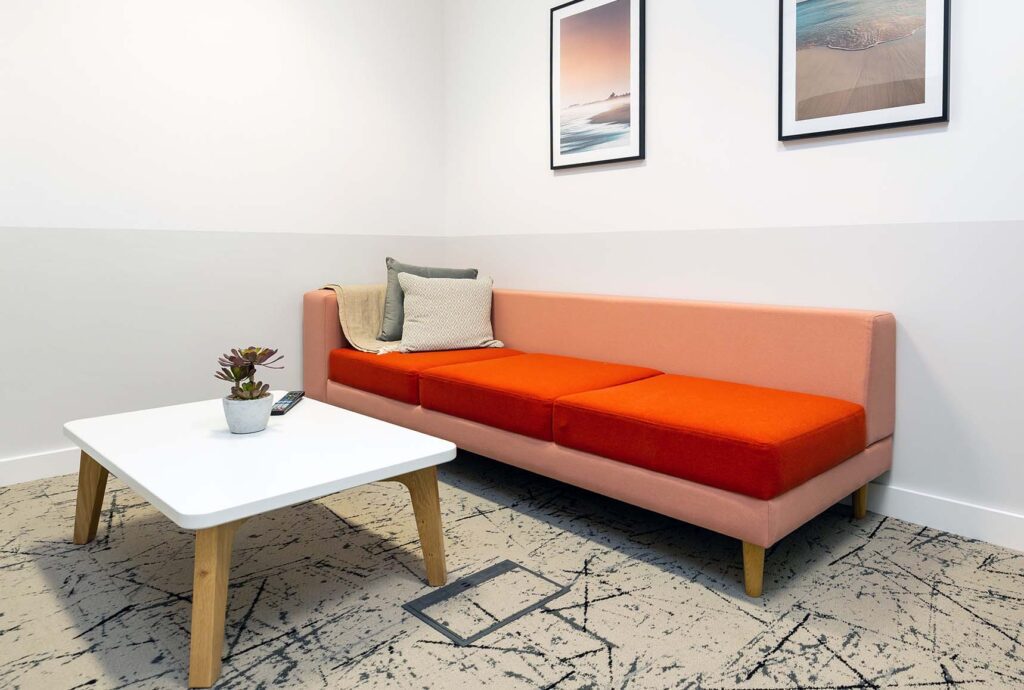
The large boardroom acts as a flexible area, doubling up as a presentation space – an agile, collaborative section, with several seating arrangements including banquettes, feature pendant lighting and curtains which soften acoustics and increase privacy as required. Dotted throughout are a variety of “hot offices” allowing individuals to escape distractions and focus on deep work or take a phone call. Bespoke ironmongery throughout lends a modern aesthetic, with a colour palette that aligns with and extends brand colours; grey and warm through timber and furniture with shades of red in different hues and saturation.
Case Studies
If you liked that, you’ll love these
Discover how reevaluating their workplace strategy helped these businesses reach new heights
Time to revolutionise your workplace?
We’d love to hear your plans. Get in touch with Charlie to see how we can bring them to life
