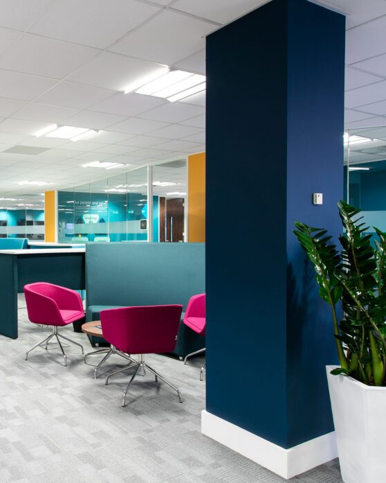
Creating a home for a global organisation working to eradicate poverty.
Development Initiative’s [DI] expiring lease turned into a great opportunity to reassess their organisational needs. With an office that felt cramped and uninspiring, they looked for our help in moving to the recently refurbished Quorum and creating an accessible, welcoming and collaborative workspace, better suited to the flexible requirements of post-pandemic working.
As a charity, it was important from the onset we reused as many existing elements as possible to maximise the budget. This meant we focused on how we could enhance the space.
This design and build project was dedicated to creating the right atmosphere through visual and decorative works. The design process was collaborative with DI playing an active role in the process.
The brief revolved around creating a hub-like space that employees would be eager to return to.
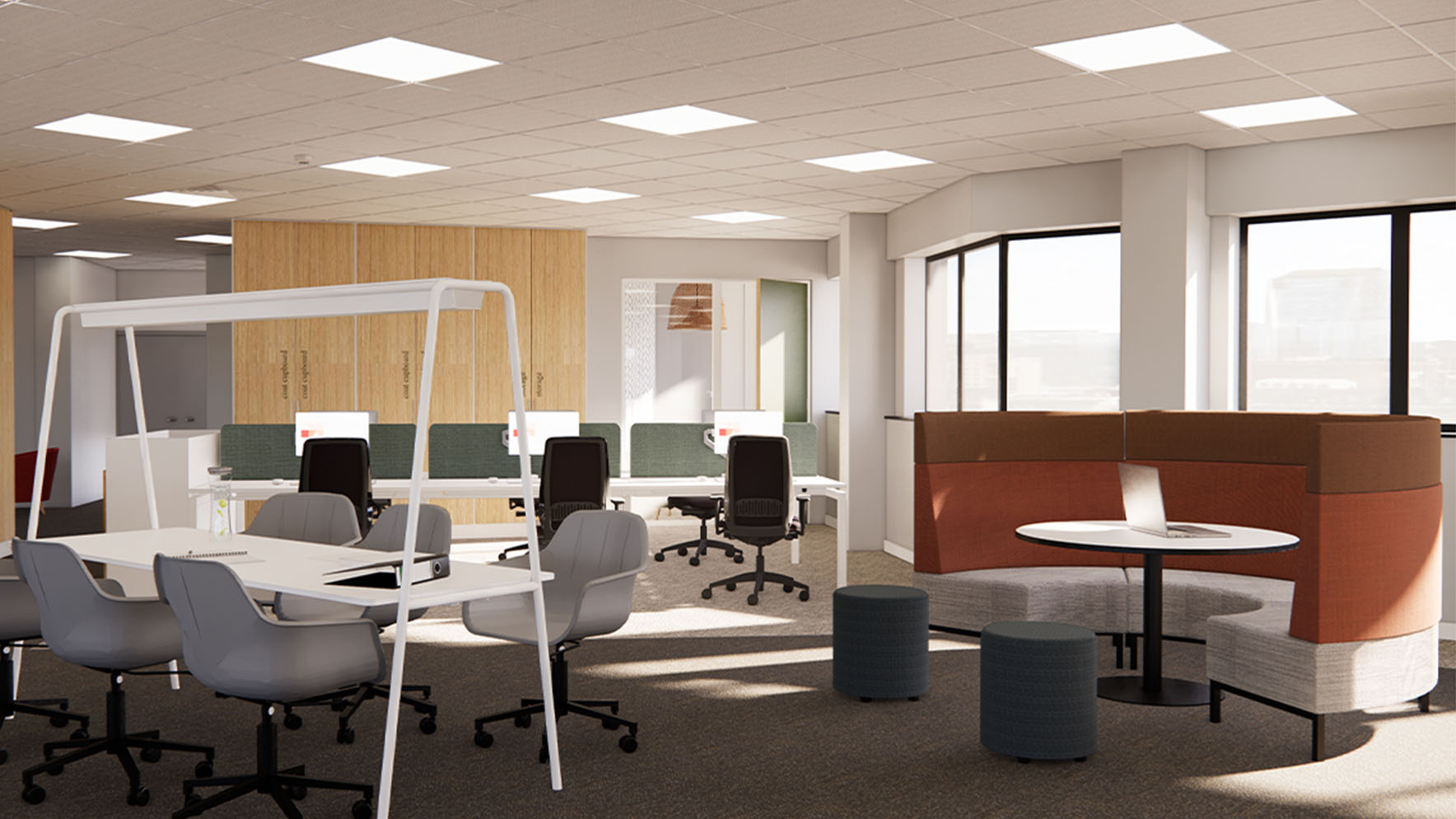
DI’s new workplace needed to provide a mix of collaboration and work stations to suit any given task, giving employees the freedom over how they work while they’re in the office. DI have a neurodiverse team, and it was important to ensure every member of staff had a place to feel comfortable, secure and productive.
A homely, enticing space
A compelling alternative to WFH
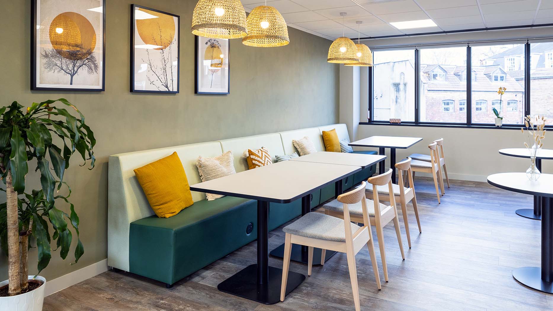
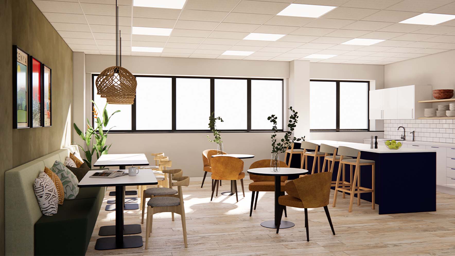
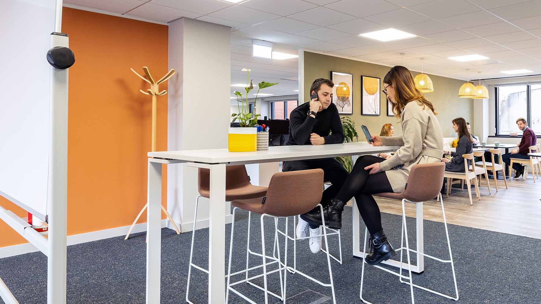
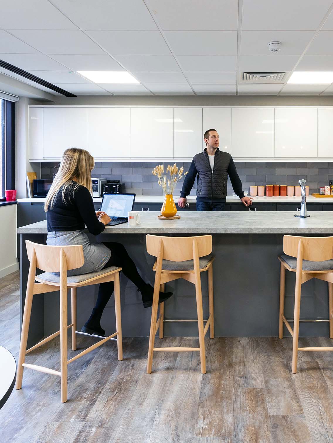
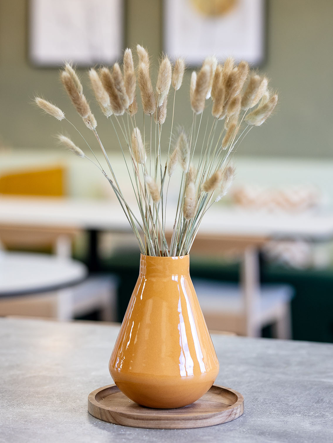
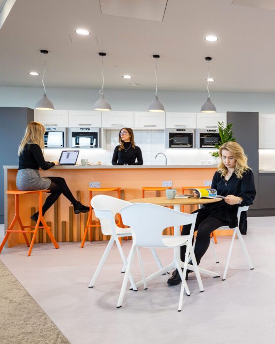
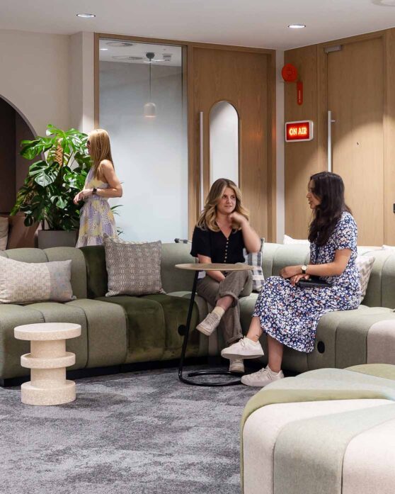
Throughout the office we have reused existing furniture and combined it with interior styling to help bridge the gap between home and the office. Soft touches make the space feel homely yet vibrant, using a mix of natural materials, textures and an earthy colour palette.
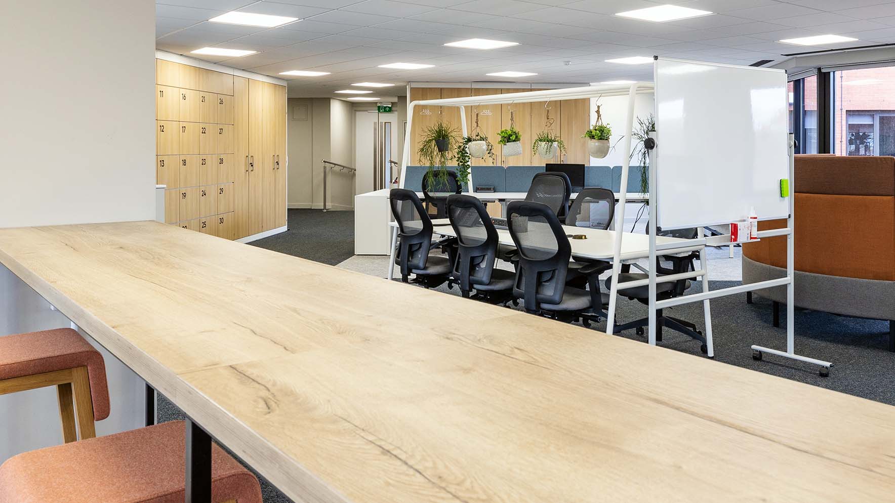
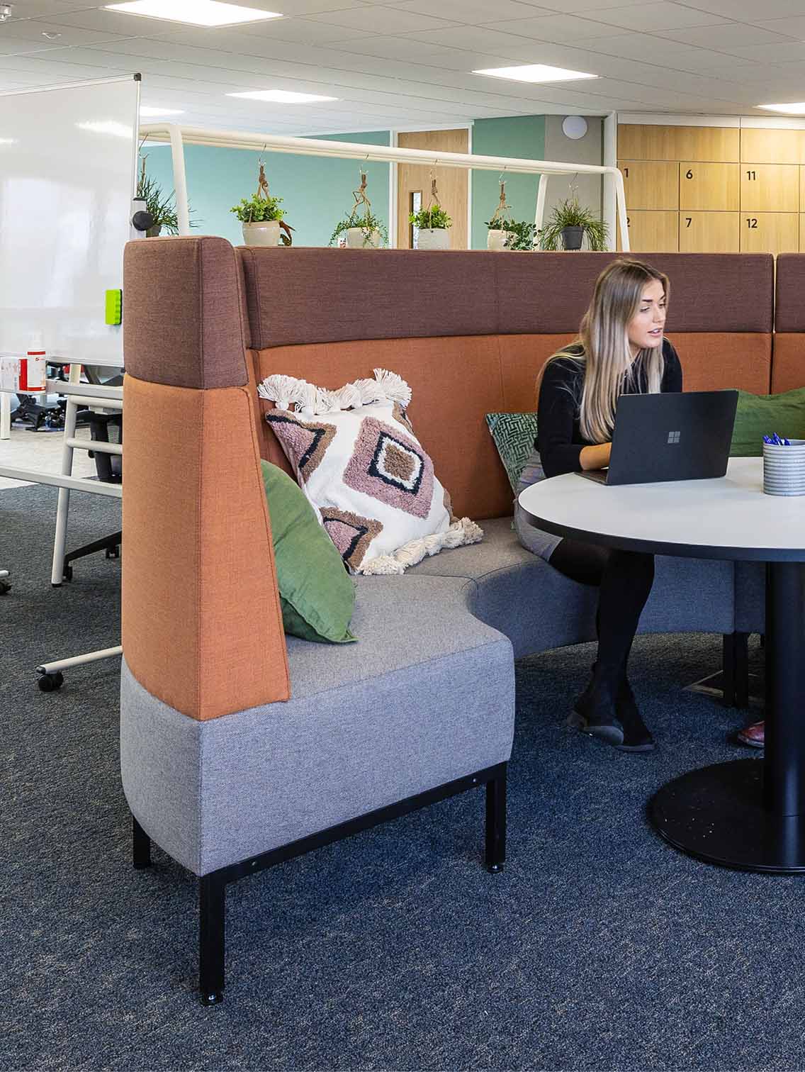
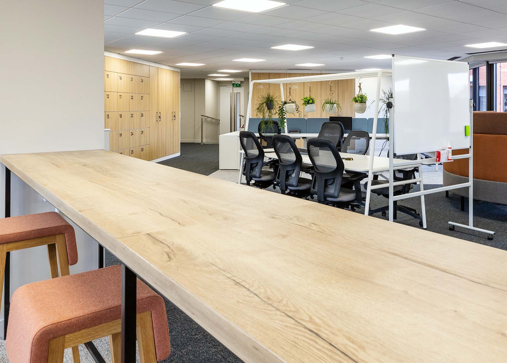
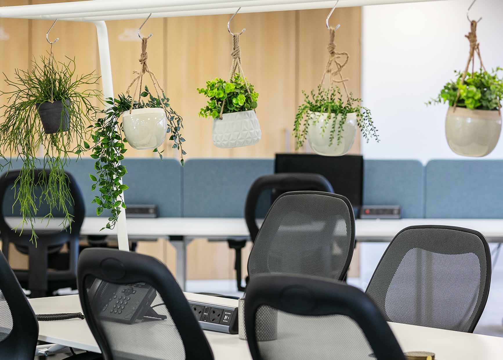
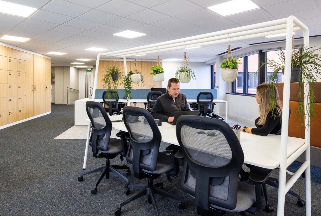
In the main workspace there are multiple places to work and collaborate; at a desk, at the central high bench, in an enclosed booth, or together at the centrepiece Ocee FourReal collaboration table surrounded by biophilia.
Other flexible areas include the addition of two new meeting rooms. The larger boardroom is ideal for company meetings and training with the potential to double up as a yoga studio. Both are finished with DI manifestation.
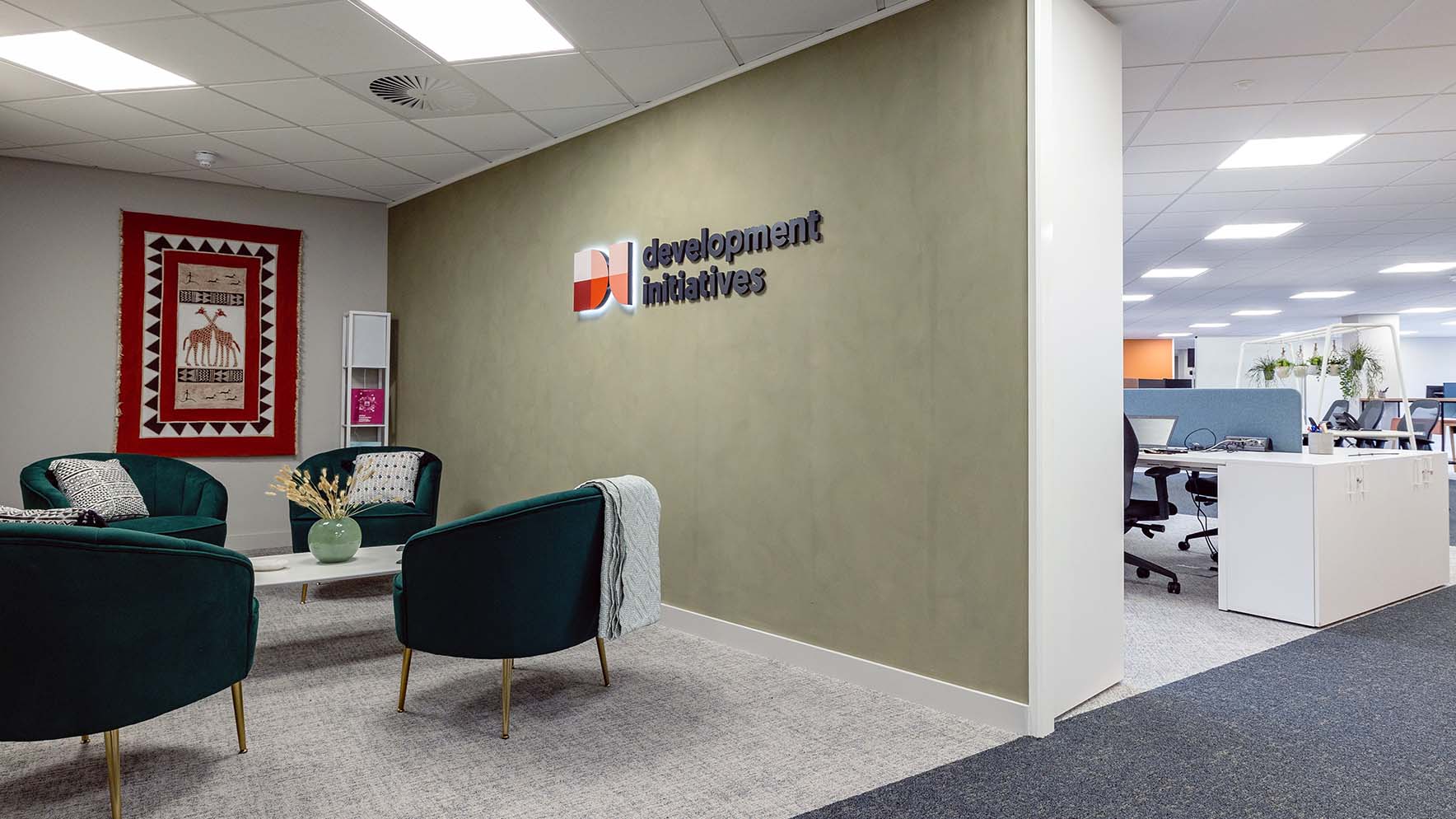
DI had some sentimental artwork like tapestries they’ve been gifted over the years; these were incorporated as focal points in the wider design.
Stepping away from traditional white walls, there are subtle yet striking features like Bauwerk limewash paint in the reception and breakout spaces which closely aligns and compliments their branding.
Finally, to acknowledge their global presence with roots in Africa and an offices in London and Washington, there are clocks throughout the space that help keep everyone from different time zones in sync.
After 6 week on site, the project was delivered swiftly and without complications.

Case Studies
If you liked that, you’ll love these
Discover how Interaction helped these businesses reach new heights or learn about our office design and fit-out services in Bristol.
Time to revolutionise your workplace?
We’d love to hear your plans. Get in touch with Charlie to see how we can bring them to life
