What to consider when designing office walls
Have you ever thought about the impact of something as basic as your walls on your workplace? Your walls can massively impact the overall ambience of your workspace, yet for many offices, they remain a blank canvas. Even if they’ve been fully decorated – there’s often so much more that can be done to make them work better for you.
Walls can be made multi-functional for storage or delineate space in new and innovative ways. Colours and designs can affect mood and stimulate productivity while reinforcing a brand’s identity. So, if you want to give your workplace a new lease of life – your walls will give you the space you need to test the limits of your imagination.
Key design considerations for office walls
Industry and brand identity
If you’re renovating your walls as part of an office fit-out or redesign, you should really start by thinking about what characterises your particular industry – and how that may affect the identity you wish to convey for your brand. Here are two examples of how this works in practice:
Creative office wall designs
Do you want your people to think outside the box? Provide a backdrop that gets their creative juices flowing. Harmonise wall décor and colour choices with your brand’s creative personality – and don’t be afraid to be a bit more bold and playful if you think it’s conducive to a stimulating environment.
In terms of design choices, consider how your walls can help create a space where ideas flow freely. For instance, maybe they can mark out collaborative spaces with workstations that can be joined together for group work. You may even want to consider whiteboard walls that can be used for brainstorming while making the space a bit more unique and dynamic.
Corporate offices
When corporate offices are based at several locations or span entire buildings, walls can help convey a unified identity across different spaces. That doesn’t mean that there can’t be variation between walls in different spaces, but the overall look and feel should be an unmistakable reflection of your branding.
For example, corporate design often involves a predetermined colour palette. It defines the dominant colours with carefully selected accents to create visual interest. In terms of trends, you can often expect palettes that are heavy on shades of blue – but don’t be afraid to go against the grain if you think that an on-trend colour or style isn’t the right fit.
Sometimes it can be difficult to design a corporate office when you have to adhere to a cohesive brand identity. After all, you don’t want your office to be generic – you’ll still want it to express what makes your office and team unique. Working with specialist office designers will help you overcome this obstacle, often with the help of employee feedback and brainstorming sessions.
Space planning
While some walls are permanent, brick-and-mortar features, others aren’t “set in stone.” Your business has changing needs, and the people in your offices undertake a variety of different activities. Good office space planning allows for flexibility, and movable walls can help make this possible. After all, they allow you to repurpose your space at will, making it possible to “redesign” your space to match your needs.
In practice, this could take the form of opening up space for group activities like an office town hall or brainstorming session, or dividing it up to accommodate extra staff during peak periods. At any of these times, your office is purpose-designed: no crowding or “making do.”
Apart from this, you may have preferences on how space should be used on your average working day. The top guideline here is the type of work your people do. There will be times when they need private workspaces to focus. But they’ll also need stimulating, interactive spaces where they can collaborate. Walls define spaces, so this is an important consideration.
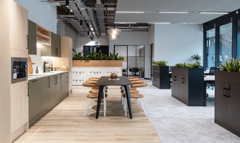
At the same time, you’d like everyone to feel like they’re part of a single team where everyone works towards a common goal. Broken plan offices are popular because they allow for this with their feeling of openness and unified space. They differ from open plan offices because spaces are still divided into distinct zones. Movable walls in the form of screens, partitions or furniture help to achieve this.
Productivity and wellbeing
Space planning and productivity are related. However, apart from ease of movement through your offices and having spaces that suit different tasks, there are a few extra things to consider.
Colour psychology is among these. Some colours like red or yellow are exciting, energising, and stimulating – but it’s possible to have too much of what appears to be a good thing. While you want your people to feel upbeat and on-the-go, you also want to enhance wellbeing. Using yellow as an example, this sunny colour can contribute to eye strain and should probably be used sparingly.
Blue is generally seen as a productivity enhancer – and there’s research to prove that it’s conducive to concentration and helps people to do more. Calming, reassuring greens are great too, and they can help stave off stress. Meanwhile, neutrals are restful and easy on the eye but will need enlivening so that they don’t come across as boring.
Sustainability
As a certified B Corp, sustainability is a key consideration in Interaction’s design choices, and office wall design is no exception. Considering sustainability will affect your choice of products and materials.
For example, find out whether the businesses you source paints and materials from work as sustainably as they can. And, when it’s time to replace materials, the old ones should be recyclable or biodegradable. After all, ethical businesses use ethically sourced materials.
“Living” plant walls are a sustainable choice and can enhance productivity through biophilia – tapping into our instinctive love of nature. Apart from showing that you’re walking the talk when it comes to sustainability, introducing plants into offices boosts productivity and wellbeing. It even has positive physical impacts like lowering stress hormone levels.
Choosing the right colours for office walls
Even though your brand guidelines indicate a palette, you’re likely to have a wide range of choices for your walls. We’ve already touched on the importance of colour psychology and how it can enhance creativity and productivity. How can you implement these suggestions, and what else should you think about?
Balance is key, and functionality can also influence your choices. For example, an entire suite of offices decorated in “productivity enhancing” dark blue could feel a bit claustrophobic if not broken up by lighter hues. And white, though a fairly safe (bordering on uninspired) choice, can feel too clinical if unrelieved by touches of warmth and colour.
As for the functionality of colour, it can be fun putting it to work for you. For example, you can use different hues and shades to demarcate different areas of the office or to highlight the purpose of a room. A serene green can underline the function of a calming contemplative space. And a more vibrant, playful colour scheme can indicate spaces for socialising or creative collaboration.
Materials, textures, and panelling in office wall design
Walling and panelling choices matter in acoustic design – an often-overlooked technicality that isn’t noticeable when done well – but makes itself felt when it isn’t. There are few things more grating than being in an office where seemingly ‘private’ meetings and workplace chatter simply reverberate through the space for everyone to hear.
Texture is important too. If you’ve opted for a tastefully understated colour palette for your walls, consider using texture to retain some visual interest. And, like colours, textures can make a statement. For example, rustic textures such as brickwork foster a warmer atmosphere and have enough visual weight to create focal points, whereas smoother, sleeker textures that reflect a lot of light are commonly used in more modern designs.
Wall partitions in modern and hybrid office design
Remember when partitions were used to create drab, stifling cubicles out of that abysmal low-quality plasterboard? Times have changed, for the most part. But many offices still use partitions, only in much more creative, exciting and functional ways.
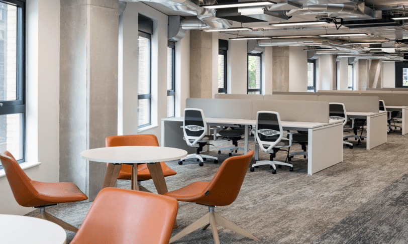
For instance, partitions could consist of table screens that reduce distractions and add a dimension of privacy without isolating employees. Mobile partitions are also a mainstay in flexible office design. Use them to mark out the areas where different teams are at work or create a meeting space within seconds. Permanent partitions, on the other hand, are great for those quiet areas that every business needs, but their placement should be carefully considered – so that nobody feels “walled in” or cut off from the rest of the workplace.
Hybrid offices are designed for people who come to the office to form meaningful and enriching connections. Therefore, they should offer an abundance of opportunities for creativity and innovation. They’re designed for interaction, and so should retain a sense of openness. That said, this should be balanced with an order and coherence through the creative use of walls and partitions – which will help to demarcate areas with specific purposes such as meetings and creative brainstorming, not to mention informal collaboration and socialisation.
Office wall ideas
Feature walls
We relish any opportunity to draw the eye and make a bold statement – and feature walls are usually the best opportunity to do so. Use them to direct attention to important parts of your office and to liven up high-traffic areas.
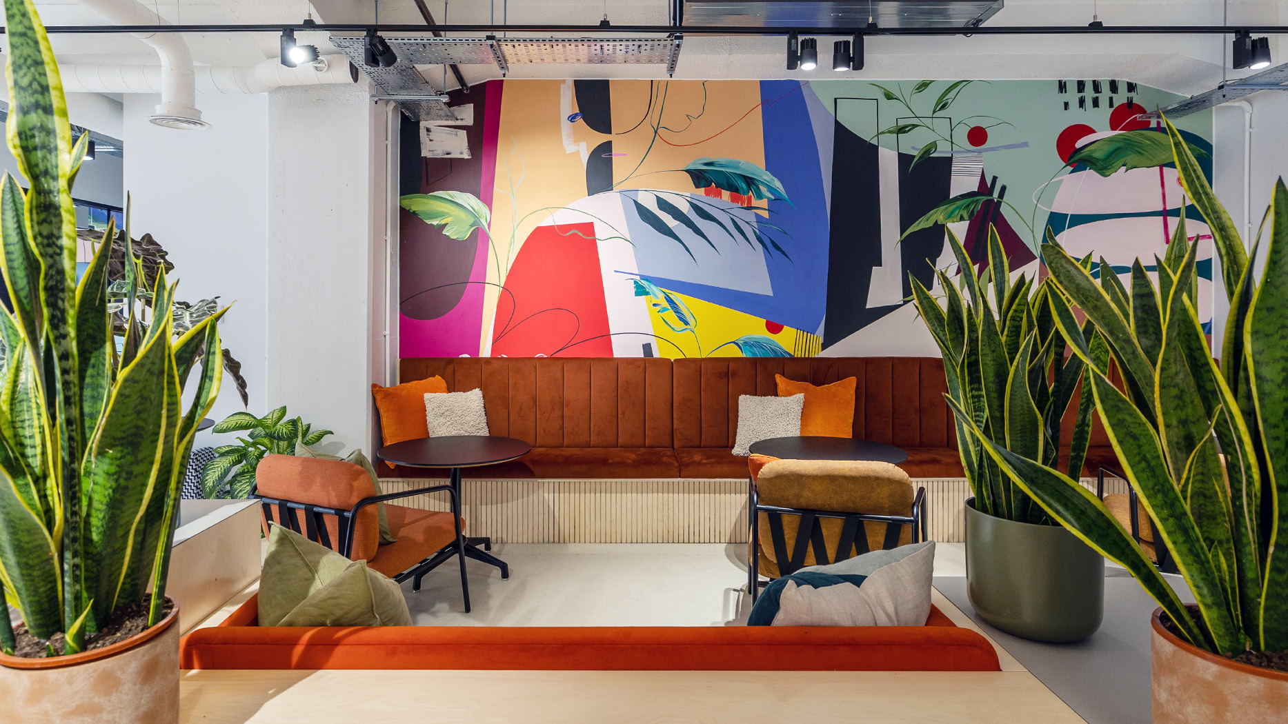
A feature wall can be an artwork in itself. Think bold patterns, murals, vertical gardens, logos or even a well-chosen collection of statement paintings or wall art. The feature wall we designed for Amdaris is a great example of how dynamic and visually striking a feature wall can be.
Accent walls
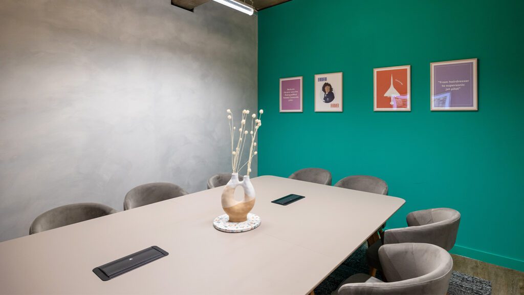
An accent wall is still unique enough to stand out, but it makes a “quieter” statement than a feature wall. For example, a wall might be a different colour to distinguish it from the adjacent walls. Here, a turquoise accent wall brightens up an otherwise neutral meeting room at Runway East, The Hickman.
Entrance walls
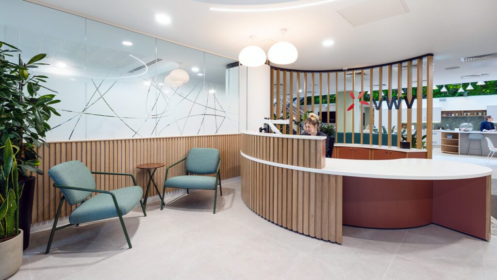
It feels obvious to say it, but entrance walls are vital for nailing that first impression. You’ll want to introduce visitors to your brand and ease them into the ambience of your space. Consider our entrance wall for VWV, for instance. The company logo pairs perfectly with the natural wood and patterned privacy glass to create a welcoming entrance space that is still on brand.
Murals
When you’re designing for co-working spaces, there may be an urge to play it safe in the hope that it will please everyone. Instead, Runway East offers spaces that can be brought to life with funky add-ons such as neon signs, in-office espressos and even ball pits! This type of space needed something bold and stylish, and we think the end result shows how walls can become spaces to let your imagination run wild.
Wall lighting
There are many ways to use lighting in your wall designs. At London and Country, we backlit the logo to make it a standout feature – and we used wall lighting to add brightness and warmth to a welcoming, lounge-like corner. Ceiling lighting can also be used to illuminate wall decor, turning design features into unmissable focal points.
Interaction: It’s our mission to ban boring offices.
No matter what impression you want your offices to make, the walls that contain them offer infinite design possibilities. Use our ideas for inspiration or, better yet, allow us to transform your offices with bold, insights-driven and innovative design. At Interaction, we’re always looking to test our abilities and flex our creative muscles – hopefully you can give us the opportunity to!
To find out more about our office design and fit-out services, why not Chat with Charlie or call us on 01225 485 600 to speak to a member of our team?
